|
|
Post by XAOTL on May 30, 2008 2:22:39 GMT 12
Well for one there are three different prizes. and they would know what to do with their prizes once they get them.
Right now I've PM'ed A_A then will contact James.
|
|
|
|
Post by CICHawk on Jun 11, 2008 13:22:57 GMT 12
It's done.  It's a bit small, but it can easily be scaled larger (and hopefully without sacrificing the quality). Now it's up to AnimeAdmirer to put the final touch of letterings, if she still wants to. |
|
|
|
Post by Anime Aficionada on Jun 11, 2008 13:28:48 GMT 12
Course I do!! (glomps)
it's so... shiiiiinnnnneeeeyyyy. *O*
|
|
|
|
Post by Anime Aficionada on Jul 1, 2008 18:45:54 GMT 12
YAY! I’ve done the trophies. Sorry the engraving ain’t that great, but it’s the first time I’ve done it on anything important. Please, don’t shoot me. O.O;; 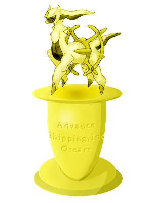 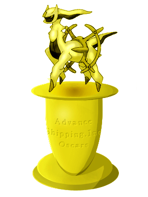 |
|
|
|
Post by Praetor on Jul 1, 2008 20:52:35 GMT 12
^ I like the first one better. It seems...shinier.
|
|
|
|
Post by thedarkfiddler on Jul 2, 2008 1:05:17 GMT 12
Yay! They's done!
|
|
|
|
Post by JbstormburstADV on Jul 2, 2008 4:35:49 GMT 12
They're... awesome....
|
|
|
|
Post by Elite4James on Jul 2, 2008 4:41:56 GMT 12
Why does it say Oscar on it?  PS Winners PM your request. |
|
|
|
Post by thedarkfiddler on Jul 2, 2008 8:49:04 GMT 12
What do you mean by request?
They look the same to me...
|
|
|
|
Post by Anime Aficionada on Jul 2, 2008 16:13:54 GMT 12
CRAP!
I forgot that these were the Arceus awards! d**n serebii messing with my brain! I'll redo them. ><
Oh, and winners, your banners will be done at the end of this week.
|
|
|
|
Post by thedarkfiddler on Jul 2, 2008 23:50:01 GMT 12
Oh, that's good.
And I just noticed the diference:
The first one has a slightly lighter shade of yellow.
|
|
|
|
Post by CICHawk on Jul 4, 2008 13:17:32 GMT 12
Excellent job. Better than I could have done. Maybe you could tell me how you did it sometime.
Though one thing, did the colors change while you were engraving it? Looks like it did a tiny bit. I like how there's a shadow under the Arceus now. Your doing? But yeah, the two do seem to have slightly different colors, and both differ from the original. Also, there are some jagged edges to it now. Fault of the photo processing? Oh, second one does look a little squished down too. Why do you have two copies anyway?
Heh, sorry if it sounds like criticism. I'm really trying not to. Just pointing out the things I noticed, and they're not necessarily bad.
**edit**
Oh, I think I might know why they look a little different and yours looks jagged. It's probably because mine is mounted on a white background, so the white jagged parts are invisible, and the colors would seem lighter. Though, your second one definitely seems darker.
|
|
|
|
Post by Anime Aficionada on Jul 4, 2008 19:13:12 GMT 12
Yeah, I noticed jagged edges too. ><;;
I'm working on the trophies again, with the RIGHT words on it, lol, but the shadow you noticed was intentional, since I finished the banner, and something looked awkward. That, in fact, was that you kinda forgot to add a shadow below the Arceus, since - theoretically speaking - a trophie without a shadow below the Arceus was a tad bit illogical, but yeah... I patched that up a bit. ^-^
The two copies I did? Just for the user's likeliness, really. If they wanted a more shiny gold look they could save the light one, or for a more in-depth bronze-ish tone, choose the latter. =]
|
|
|
|
Post by CICHawk on Jul 5, 2008 16:25:45 GMT 12
Eh, not much can be done about the edges. Just mount it on white I guess. Actually, now it looks fine since I can see white behind it, but that just might be the current browser I'm using (IE 6.0) as opposed to what I usually use (Mozilla)... that or you just changed it.
And yeah, the colors do seem more like the original with the white behind. Darker copy is nice too.
Heh, I completely forgot abotu the shadow under the Arceus. Well, thanks for patching that up for me. Good job overall.
|
|